SASC (Sexual Assault Support Centre of Waterloo Region) |
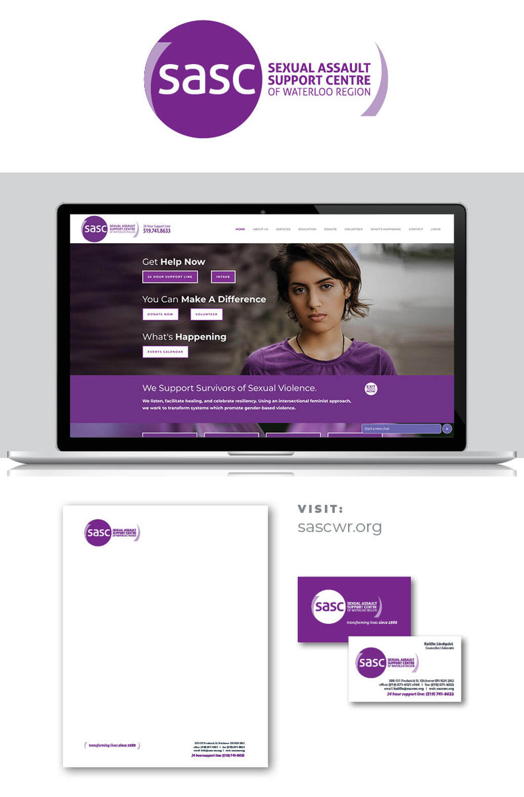
BRAND IDENTITY
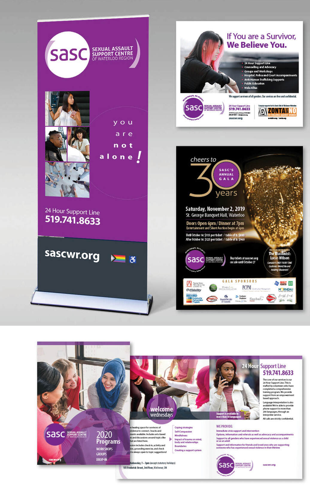
WEBSITE EDUCATIONAL MATERIALS DISPLAY EVENTS |
SASC (Sexual Assault Support Centre of Waterloo Region) |
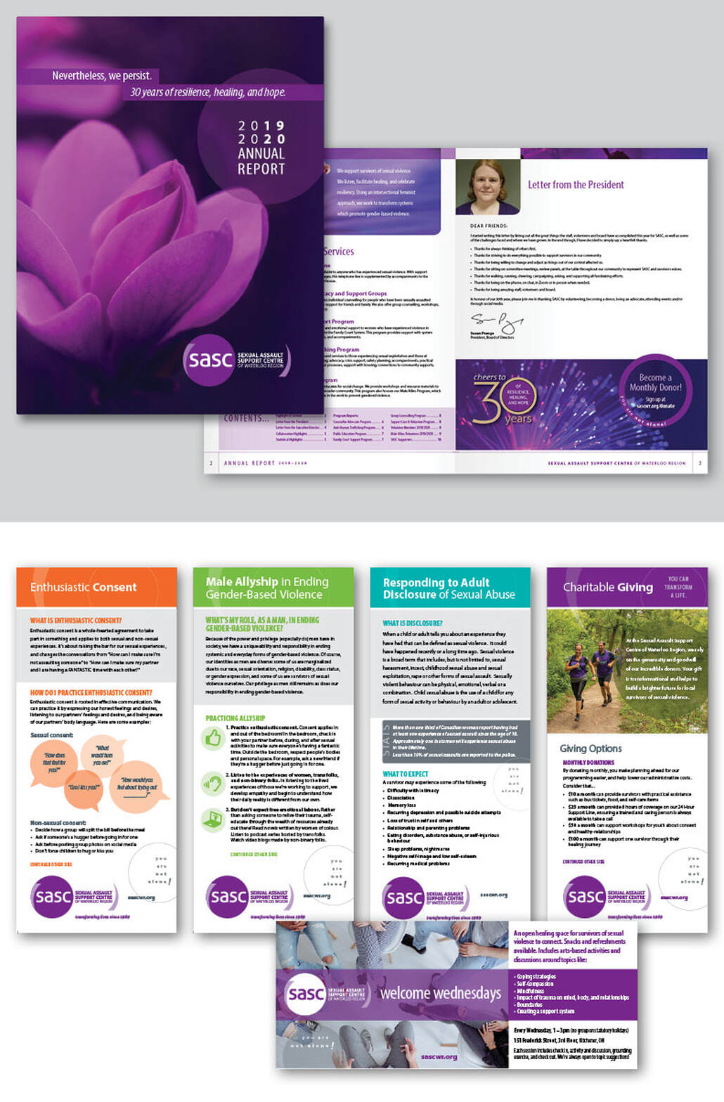
BRAND IDENTITY
WEBSITE EDUCATIONAL MATERIALS DISPLAY EVENTS |